What Are High Fidelity Wireframes?
A high-fidelity wireframe is an extremely detailed diagram that communicates your discovery with perfect clarity.
#1
Create unlimited mockups and prototypes for your projects
#2
Build mockups using drag-and-drop builder
#3
Choose from the wide range of pre-built templates
#4
Share mocks and collaborate across teams in real-time with notes and activity logs
#5
Design, run user tests and share mockups across teams
#6
Get a control over mock versions
#7
Share designs with your team through mock links
#8
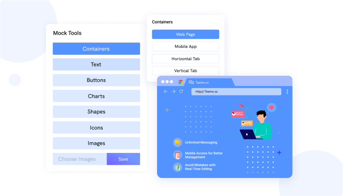
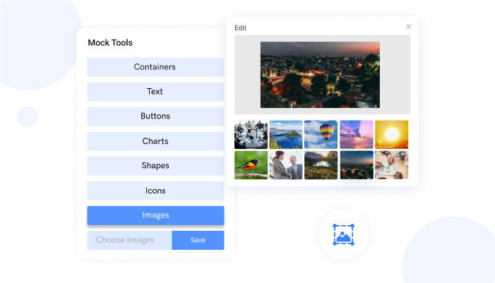
Design mocks faster using components such as containers, charts, images and buttons
#9
Unbelievable pricing - the lowest you will ever find
#10
Everything your business needs - 50 apps, 24/5 support and 99.95% uptime
A high fidelity wireframe shows all the details of the page, including what the user will see when they scan down the page. In other words, these wireframes are extremely detailed and show every single element on the screen.
A high fidelity wireframe is not just a sketch or a simple outline. It is an extremely detailed diagram that communicates your discovery with perfect clarity.
High fidelity wireframes are the result of an accurate discovery process. They help you communicate your discoveries in a visual way that is crystal clear and easily understood by your team, clients and even your users.
Why Make High Fidelity Wireframes?

One of the main reasons why you should start making wireframes with wireframe creator is simply because they help you make better decisions. When you are armed with accurate discovery, you will make much better decisions about what to include and what to leave out. This will make your project go much more smoothly and quickly.
In short, you will be able to create a more usable and therefore, a higher quality product. Creating high fidelity wireframes takes time, you are essentially creating a photo-realistic diagram of the entire site or screen.
Low Fidelity vs High Fidelity Wireframes: What’s the Difference?
There is a huge difference between a low fidelity wireframe and a high fidelity wireframe. A low fidelity wireframe shows only the barest bones of the page or screen. It is not detailed enough to show every single element on the page, usually containing black and white schemes or simple sketches. It doesn't require a lot of effort but it gets the job done.
In other words, a low fidelity wireframe is like a simple sketch or outline. A high fidelity wireframe, on the other hand, is extremely detailed. It shows every single element including colors, fonts, graphics, layout, and even individual button labels.
High fidelity wireframes can only be developed in wireframe or prototyping software. They are not something you can create with a pencil and paper. They require intimate knowledge of every single aspect of the project. In fact, some people refer to the process of creating a high fidelity wireframe as ""tearing down the walls"" of the project.
You know that project is well underway when the walls come tumbling down. At that point, you are free to explore the project without limitation. You can create complex interactions between all the different elements and discover new ways to enhance the user experience. All of this cannot be predicted by a simple sketch or outline. It can only be discovered through exploration.
When to Use High Fidelity Wireframes
When you need constructive feedback and validation from your target audience, cleaning up bugs in your interface, and simulating system responses, low-fidelity wireframes won’t do the job. High fidelity wireframes help bridge that gap and capture more of what you really want to provide.
There are 3 main Benefits of using Them
Outstanding Interactivity
An outstanding user experience is only possible when all the pieces of the puzzle fit together perfectly. High fidelity wireframes give you the ability to test out different combinations of elements and interactions much faster than any other method. If you discover something that doesn’t work, you can tear it out and try something else. In most cases, you will discover something even better. This is especially true if you are making a website, where every single pixel counts.
Realistic Experience

User testing is one of the most important parts of the UX designer’s kit. High fidelity wireframes look very similar to the final product. Summing up all the little details into a photo-realistic image gives users an accurate sense of what to expect.
More importantly, it gives them a realistic sense of what it will be like to use your interface on a daily basis. This can have a profound effect on their perception of the site or screen and the experience that they have while using it. This gives you an invaluable advantage when it comes to getting immediate validation from your target audience.
Fewer Chances of Human Error
With clickable wireframes, tests are much more accurate, less prone to human error and interactions are built-in. Nor will they be as much of a distraction when you are doing usability testing. The process of clicking around and interacting with all the different page elements will become a natural part of the testing process. This helps cut down on the amount of manual input needed during the test, which reduces the chances of human error playing a part.
Design High Fidelity Wireframes with Mockframe
Ready to create high-fidelity wireframes for your product with MockFrame? Sign Up FREE for 10 users
Ready to build your first high fidelity wireframe? Mockframe is the industry standard wireframe tool. It is easy to learn, has an intuitive drag and drop interface, and comes with all the features you need to create high fidelity wireframes. Create, collaborate and manage - all at one place. Keep track of revisions, annotations, comments and everything else with ease."


